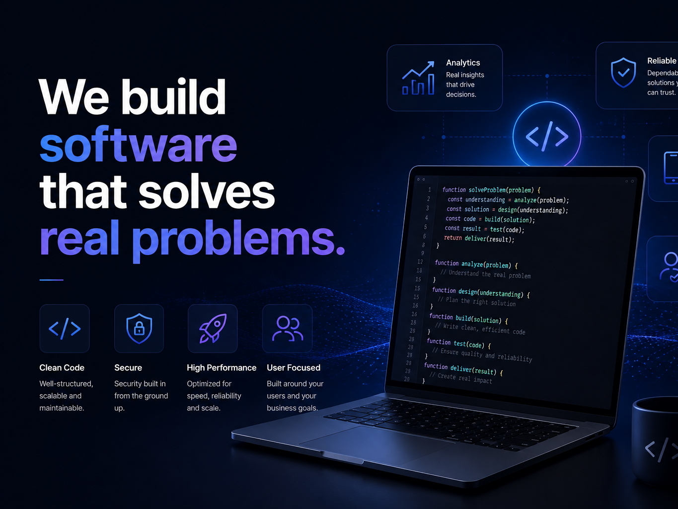
Design System UI Kit
Client
Pulse Analytics
Category
SaaS Technology
Year
2025
Tag
Design

Project Overview
A shared component library so Pulse's product and marketing teams stopped rebuilding the same button five different ways.
The Challenge
Every new feature at Pulse shipped with slightly different spacing, colors, and component behavior because there was no shared source of truth.
What We've Done
We audited every screen in the product, consolidated the real patterns in use, and delivered a Figma + code component library their engineers could adopt incrementally.
- 1 Full Product UI Audit
- 2 Component Library Design
- 3 Figma + Code Handoff
- 4 Engineering Adoption Support

Project Results
New feature UI reviews got noticeably faster once designers and engineers were referencing the same component set.
+
Reusable Components
%
Faster Design Reviews
Gallery




Ready to Start Your Project?
Talk to our team about what you're trying to build — we'll tell you honestly whether we're the right fit.
GET A FREE CONSULTATION